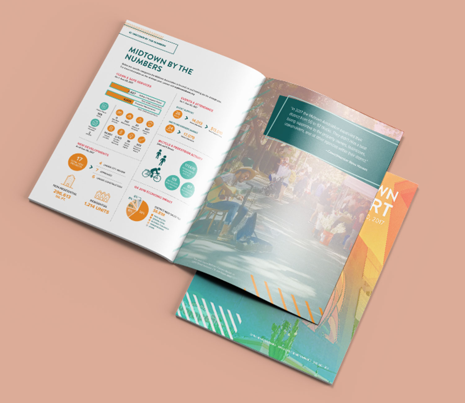
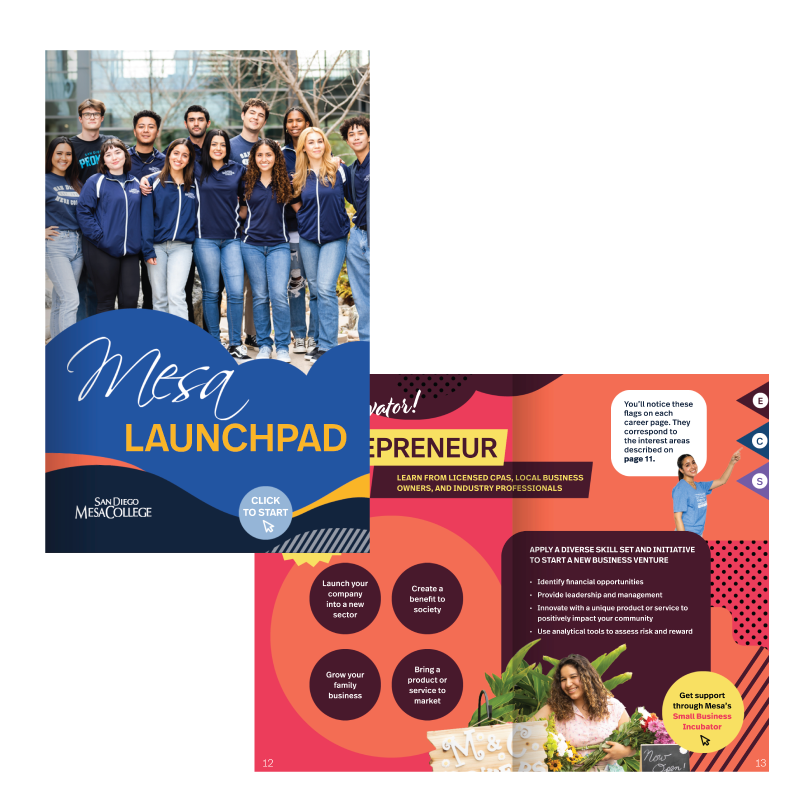
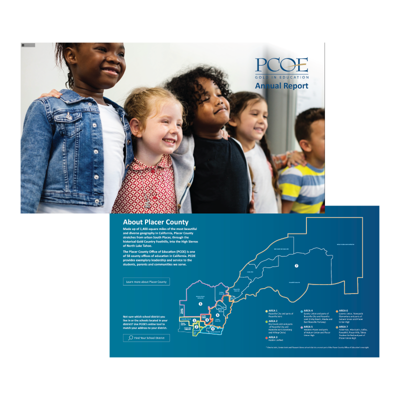
One of our core beliefs at 3fold is: “fine” is not a compliment. Your annual report should never be “fine.” Anytime you invest time, money, or effort into creating something to help communicate with someone, make it worthy of that investment.
But most importantly: make it actionable.
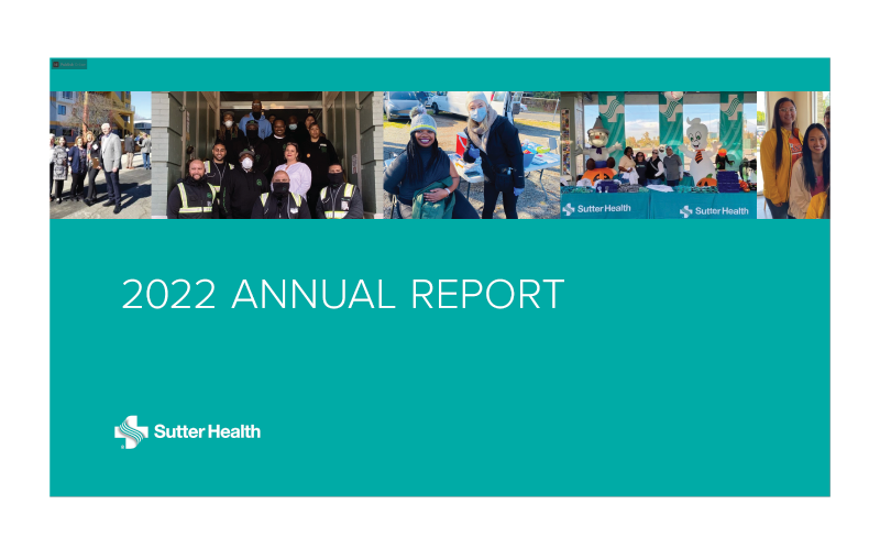
We’ve produced all variety of “annual report” for our clients—from the traditional year-end wrap-ups required in the nonprofit realm, to hospital systems reporting on their community outreach and public health impact, to school districts outlining their successes on behalf of students, families, and communities. Even versions of employee onboarding and customer wayfinding guides fall into this category.
From this vast experience, we have seen how a strategic approach to annual report development accomplishes far more for than a perfunctory one that simply checks a box. It can be used to reprioritize a mission and purpose, strengthen trust and stakeholder support, inspire and reinvigorate a team, and boost new donations and investment.
How to use your annual report to connect with audiences
While current and potential donors or investors are often the primary audiences for annual reports, other groups are essential to furthering its impact. Your employees, customers, alumni, partners, and other community leaders and influencers all play a role in, and benefit from, your organization’s work.
How do you create a multifaceted report that speaks to multiple audiences and inspires them to act on your behalf?
1. Choose a storytelling theme.
Like a great movie, you need a plot people that draws people into the story. Look for an over-arching theme under which to organize your content and visuals. Often, organizations use their missions. Again, that’s “fine.” However, consider thinking bigger and aligning your theme to the trending priorities and challenges happening within your community, not only telling your story but communicating your relevance.
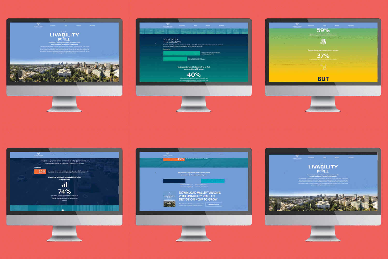
2. Use cohesive but audience-specific design.
Taking the time to be thoughtful with the visual design of your annual report not only compels people to spend time reading it, but also creates opportunities for differentiating your storytelling for unique audiences. Think through your graphs, your icons, your infographics, your photos, and, even, your white space to insert opportunities to grab specific attention.
3. Don’t just look back, look forward.
Annual reports usually document what was accomplished in the past year. Go beyond and include your vision of what lies ahead. This vision should provide stakeholders with a deeper understanding of what you do, why you do it, and how effective you are. This gives people a reason to trust you, invest in your work, and maybe even commit to working for your organization.
4. Remember: every number has a name.
Too often, organizations shine the spotlight on their numbers alone. This was spent here, this was raised there, and so on. Is anyone ever inspired to act by this? Bring your numbers to life by finding examples in them that display the humanity of your work and make your audiences feel something about those stories. Be real, be authentic, be transparent.
5. Be interactive
A printed annual report is “fine.” A report that moves, engages, and immerses audiences in the story is great. Include clickable slides, evolving numbers, expandable graphics, and playable videos in the content. Additionally, a digital report is often updatable, allowing it to represent an annual movement and not a moment in time.
We get it. Creating a ”fine” report does the job. However, it can also undermine your strengths and successes, diminish your brand and purpose, and leave your audiences feeling more like afterthoughts than activists in the work.
However, by taking advantage of the above recommendations and working with a strategic team (including your own internal staff and outside storytelling experts, like those at 3fold) to curate and craft a priority-driving story, your report could be one of the most powerful communication tools in your toolbox. One that supports your fundraising, marketing, and recruiting efforts. Strengthens your organization’s reputation and awareness with key audiences. And ensures stakeholders, partners, and community leaders understand your importance and their role in your sustainability.
Let us help create your next annual report. Reach out today!

