It’s a universal truth that it’s harder to do for yourself what you can so naturally do for others. Everyone has heard of a mechanic with a broken-down car, an architect whose house is a wreck, or a hairstylist whose significant other is sporting an overgrown ‘do.
That’s the exact position 3fold found itself in. After almost 20 years in business, it was time for 3fold to take a sober look at its own branding and decide if the time was right for an update. The result of that “sober look” was an in-depth audit of what was and wasn’t working, followed by a year-long creative and strategic process to overhaul the agency’s logo, color palate, font suite, and brand elements.
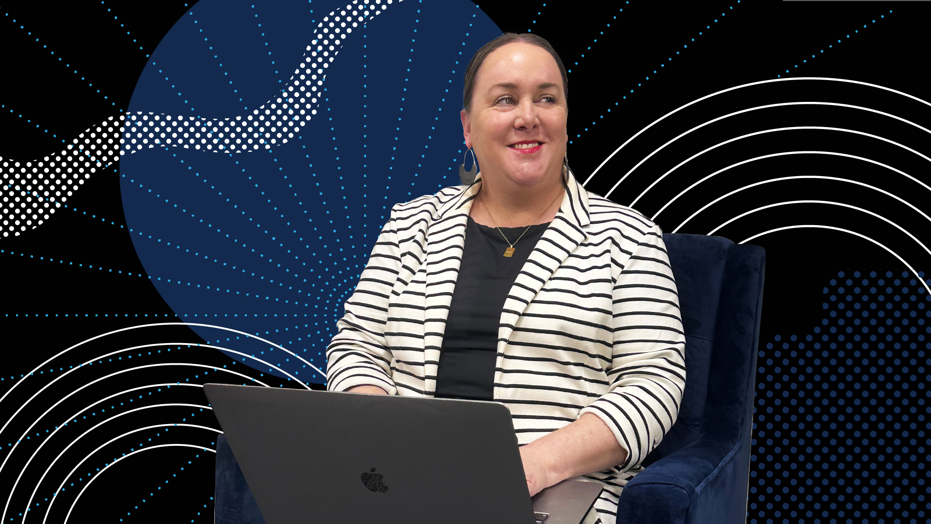
“After many discussions about where we were headed as an agency, we found that our team had the same ideological motivations for what 3fold’s visual identity should be, and that was a solid foundation for the project,” says Jamie Von Sossan, managing partner for 3fold. She and the leadership team encouraged uncensored self-awareness and honesty about the brand that allowed the for identification of effective brand elements that could remain or be polished and those that needed to be scrapped entirely.
The final project scope included logo design and typography refinement, complete overhauls of the company’s font suite and color palette, and reimagining of ornamental illustrative elements that helped extend the brand identity across platforms and applications.
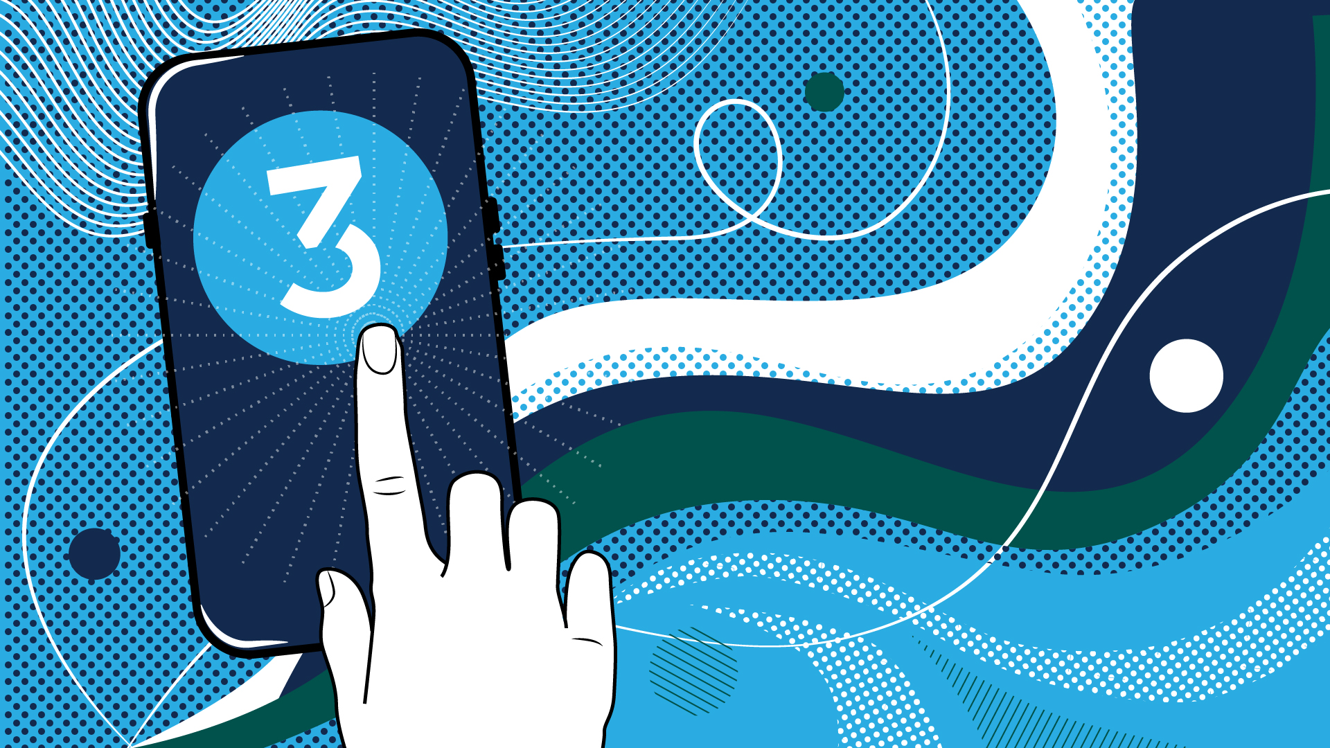
The logo refinement, color palette and typefaces were the most straightforward aspects of the project. Of the logo, small tweaks made all the difference in strengthening the “3” icon. You don’t always have to completely scrap and change a logo for it to be successful. Minor changes can make a huge difference.
Color palette changes went a bit further, with 3fold retaining its signature blue and updating all secondary colors surrounding it. We used the bright blue as a starting point because we could rehabilitate it. Once we decided to keep that color, we knew we needed to surround it with smarter colors…the old color palette’s time had passed. Not only is the new palette a fresh take and new look for the brand, but the secondary colors help the signature blue stand out in ways that it hadn’t before.
Moving to typefaces, the creative team made sweeping changes that took the look of brand materials to new levels. Looking for something “sturdy” that could stand the test of time by being both modern and classic, the team chose Termina and Muli for headlines and body text, respectively. According to the creative team, it communicates a gravitas that we didn’t have before. We wanted it to be cool but not overly trendy.
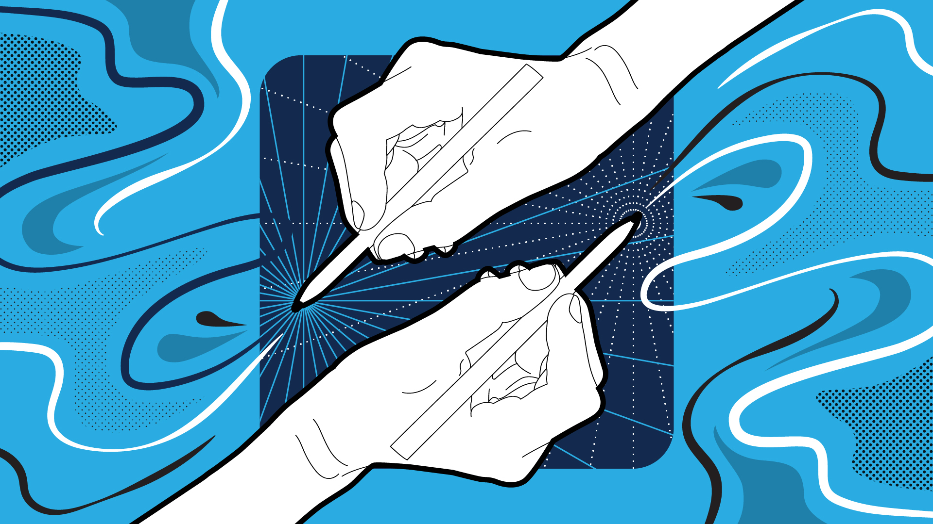
The final piece of the brand puzzle to tackle was brand elements. Through the audit process, the team discovered a shared sentiment that many disparate elements had crept into the visual identity over time and that there was a need to not only start over, but to develop brand discipline with new elements.
We were initially set on stripping the visual identity package of ornamental illustrative elements entirely, noting that they can root a brand to a very specific point in time—but the creative team eventually concluded that a modern graphic could be successful if done well. The team leaned on graphic designer Z LaFrance to tackle the concept of creating an abstract art piece that matched the modern yet timeless look of the typeface.
“For the illustrative element, I started with the idea of creating something simple and repeating like a pattern, but then I started playing around with overlapping and combining shapes,” Z said. The resulting graphic is one that can be used as a whole or in part. “There are a million ways of cutting, splicing, rotating and changing the colors,” they say, making the element useful across a range of applications.
We should note that this work wasn’t done in isolation. The same audit that resulted in the visual identity refresh also had implications for the agency’s business and messaging strategies, as all work in tandem to meet the agency’s goals. But the outcomes of all were the same—it was refining who we were into who we are. The end result? A fully cohesive visual identity that will take the agency into its next iteration.